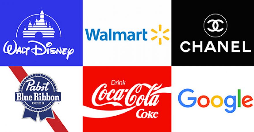
BY RAY RICO AND DAPHNE BUTLER – A responsive logo is a logo whose design elements vary slightly depending on the device or screen size they are displayed on without sacrificing brand identity. The design elements in question could be icons or symbols, business names and slogans, colors, backgrounds, outlines, and other details. Creating a set of logos that simplify the design as the pixel size for its canvas shrinks can help capture the crucial identity for your brand.
Here are the easiest tips to design an effective responsive logo.
- Simplify design. When your screen gets smaller, you ought to simplify nonessential elements like taglines. As things get smaller, consider the most importantly recognizable element for your branding and logo and use that in its simplest form.
- Reduce extras. When branding your logo, use what you need to have a recall for your name and any icons you use. Let go of the extras like frills in design, extra colors, and descriptors.
- Choose color. Identify a color that works for your brand and fits your needs. Use that color consistently and it will help consumers recognize your brand simply the color you use.
Full company logo:

Full company logos are perfect for collateral that communicate like stationery letterhead. It’s also helpful to use full company logo branding when collaborating or cobranding.
Company logo without tagline:

This version of logos should be used for branding purposes like on promotional items, uniforms, and in some instances for advertising. This version is simple, yet recognizable.
Company logo stacked:

This version is great for social media, mobile screens, and smaller promotional items. This version is also simple, yet recognizable.
Icon only:

If your original logo is complex but includes an icon, consider isolating your icon to use for a favicon on your website, on your social media profiles, on the mobile version of your website, and on your products. A logo icon like this one is versatile and scalable.
Alternative backgrounds:

If your logo has white text or white background, you may want to use an alternate background color that complements it well.
Black and white:

Black and white logo variations are essential to have if you plan on running a print campaign. B&W logos can also save your business hundreds of dollars on color printing costs.
Our team is comprised of branding experts who are here to make your identity a memorable one. Following these guidelines for your brand will help extend its image across multiple platforms in marketing with recognition top of mind.
Additional reading:
Color in Marketing
Graphic Designers – Worth It or Not?


