I stumbled upon this great Typography Cheat Sheet article just recently published –
Typography Cheat Sheet
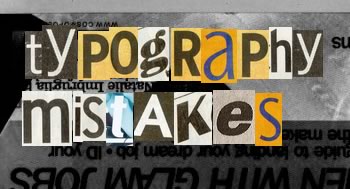 Typography is one of those strange skills — too mathematical to be pure art, but a touch too intangible to be pure science.Our modern life is awash with text, so all front-end devs really need to have a thorough working knowledge of the “art of arranging type”.So, let’s run through a quick-fire cheat sheet of some of the most common typography mistakes — and ways to avoid them.
Mistake 1: Mis-judged Text Line Lengths
Many designers tend to not pay enough attention to the number of characters in an average line of their text and adversely affect the readability of the text.
Happily, this is an easy mistake to avoid, as the optimal length has long been identified.
The great Swiss typographer, Emil Ruder did a lot of work on this topic in the 1950?s.
In his seminal essay, “Typographie: A Manual of Design”, he concluded that the ‘sweet spot’ for line length was around 50 or 60 characters.
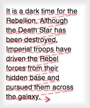
His tests found readers had more difficulty tracking from one line ending to the start of the next when scanning longer, horizontally strung-out texts. In fact, readers would often have to re-read the previous line to ensure they had located the next one.
On the other hand, short line lengths — predictably — force the eye to spend more time scanning down and to the right for the next row.
In either case, a bad choice of the line length will contribute to stress, distraction, and reduced comprehension and retention.
Of course, in the era of responsive design, line lengths are no longer a static number.
Fluid layouts mean you will need to treat line lengths as a ‘range’ between breakpoint, not a number. I would advise keeping the lower end above 45 characters and the upper end below 80.
Mistake 2: Tracking: The In-Betweeners
![]()
Logos, titles, book covers and other
larger texts often employ much tighter
tracking than any body text could tolerate.
Sometimes designers don’t pay enough attention to the space between letters — technically referred to as “tracking”. The distance from one letter to the next is a critical element in reading fluency.
This can be tricky because it’s very common for logos, headings and book covers to create an internal cohesion by reducing tracking — they even sometimes use negative tracking to force letters to overlap (the old ebay logo).
As you can see in some of the famous examples above, this can look fantastic.
However, if you were then tempted to try the same approach with your body text, this is almost always a mistake.
A 2006 study from a Pacific University team showed that even small reductions in the default letter spacing lowered reading speeds immediately. Interestingly, gradual increases in the letter-spacing above the default, didn’t alter reading speeds significantly until those gaps exceeded one full letter width.
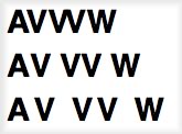
Letter-spacing set to -4px, default and +4px respectively.
If you want to be sure that the “tracking” of your words is correct, there are two easy tests.
You should always check that “AV” is easy readable and that it is possible to see the difference from “w” and ”vv”.
On the web, tracking is controlled by the ‘letter-spacing’ CSS property.
![]()
This property has good browser support, although unfortunately the more useful ‘em’ units are less reliably supported than plain old ‘px’s.
Source: Pacific University (PDF): Effect of Character Spacing on Text Legibility
Mistake 3: Badly Paired Fonts
Photo: ejorpin
Not long ago — before the ‘rise of web fonts’ — this was a more difficult mistake to make .
As little as three years ago, web type selection decisions were much like school uniforms decisions. With a limited range of system fonts available to us all, no-one looked stunning, but fewer looked terrible either.
Easy access to a galaxy of new fonts, has opened the scope for greatness — but also new and awful ways to make mistakes too.
First of all, it’s important to note there are no precise formulas to follow when pairing typefaces — just some guidelines.
You always have to remember that harmony is most likely your aim, but that you can reach it through the use of contrasting fonts.
By “contrast”, I mean finding typefaces which are different, but at the same time which can complement each other. This is tough to get right, but can deliver an outstanding and unconventional result.

David Curcurito’s Esquire magazine covers
break almost every rule of layout and type.
David Curcurito’s Esquire magazine covers are legendary for their total disregard of traditional views on white space, consistency and even legibility — yet they’ve somehow succeeded wildly in newsstands.
This means, you don’t have to necessarily rule out using a bold font with an ultra-thin one or a big typeface together with a smaller one; you can evoke the idea of contrast.
In this case, you should certainly consider the matching of “serif” with “sans serif” fonts.
A common way to pair them is to use a decorative “serif” for the heading, while it is better to leave a “sans serif” typeface for the body since it provides a higher level of legibility (on screens anyway).
As Esquire demonstrates, there’s rarely a situation where only a single pair of fonts can be used, so my advice is to make several experiments before arriving at the final end.
Only in this way you’ll be able to get a result that satisfies your needs in the best way possible.
Mistake 4: Inappropriate Body Font Choices
Because of the huge range of available fonts, choosing the one to use in your work may not always be an easy point.
Often designers will fall in love with a wonderful new typeface and then immediately look for places to work it into. I think we’ve probably all done this.
Let’s look at an example:
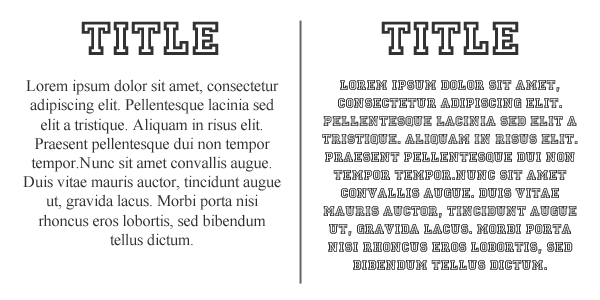
Unfortunately, this is a case of ‘When Good Fonts Go Bad!‘. You can see how a stunning decorative font used in a heading, becomes offensive when used in body text.
In this latter case, the legibility of the text is damaged and a reader would probably not pay the right attention to the paragraph because of the difficulty in understanding the words.
So, when rendering any body text, my suggestion is to opt for a linear, classic and easy-readable typeface.
Another very common mistake is choosing fonts without properly considering the reasons we are writing in the first place.
In fact, you should know that it is possible to adapt typefaces according to different situations.
For example, “serif” fonts, which can convey an idea of authority, are usually appropriate for formal documents such as legal texts, resumes or scientific papers.
Alternatively, if you need to write a friendlier and informal text, you can quietly decide to use a “Sans Serif” typeface or a thick and very rounded one.
Mistake 5: Poor Color Choices
Another great factor which contributes to increase the readability of a text is the colour chosen for the background as well as the one used for the text.
A general mistake is to use two tonalities that are too much similar to the point that distinguishing the words from the surrounding becomes very difficult. While this is irritating for most users, it’s generally a show-stopper for anyone with vision problems.
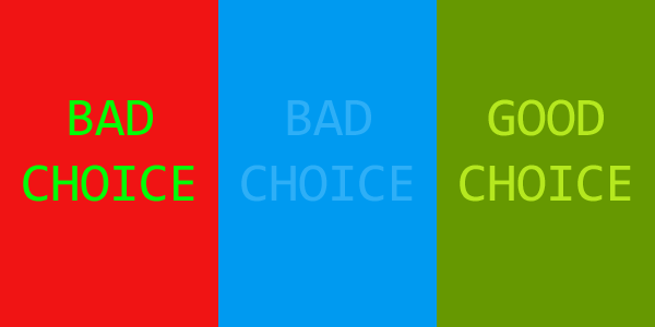
You should also be aware that some colors may create an awful and eye-gouging effect: it’s the case of green and red or white and yellow, never use them together.
In conclusion, whenever you need to select two or more colours for your work, I suggest you looking for a proper contrast, neither too excessive nor too weak.
Mistake 6: Leading
“Leading” (pronouced ‘L-ed-ing’ not ‘L-EEee-ding’) is the vertical distance between two consecutive lines of the text.
Photo: jcolman
This term comes from the strips of ‘lead’ that traditional letterpress printers would tap into place to secure each row of lettering.
Many designer fail to give the right importance to that feature and, as result, they may get “descenders” of a line overlapping “ascenders” of a lower one. Alternatively, if you put too much space between the rows, you will get a loose, hard to read text.
To avoid these issues, a good rule of thumb to start with is 140% of the font size.
For example: imagine your typeface dimension is 20pt, the right line-height is about 26-28pt.
However, keep in mind that “serif” fonts generally need more leading than “sans serif” ones, while heavier, block types require more vertical space than lighter words.
And that wraps thing up for now. I hope these tips help you to have fun with type.
Article originally published on: http://www.sitepoint.com/typography-cheat-sheet/ By Simon Sala
